




5 Document Design Tips

Good design gives a document personality and makes it more appealing. A well-designed document will help to get your message across by improving the clarity and legibility of the content. A well-designed document is not just easier to read – it reduces mistakes, improves efficiency, and saves time.
This infographic provides five design tips on how to create a document that not only looks good, but also reads well. The tips are principles, not hard rules, so there is scope to be creative in the design of a document – provided that you maintain a balance. Be careful not to make the design too busy as it will be harder for the reader to pick out the key points.
Click on the infographic to enlarge it.
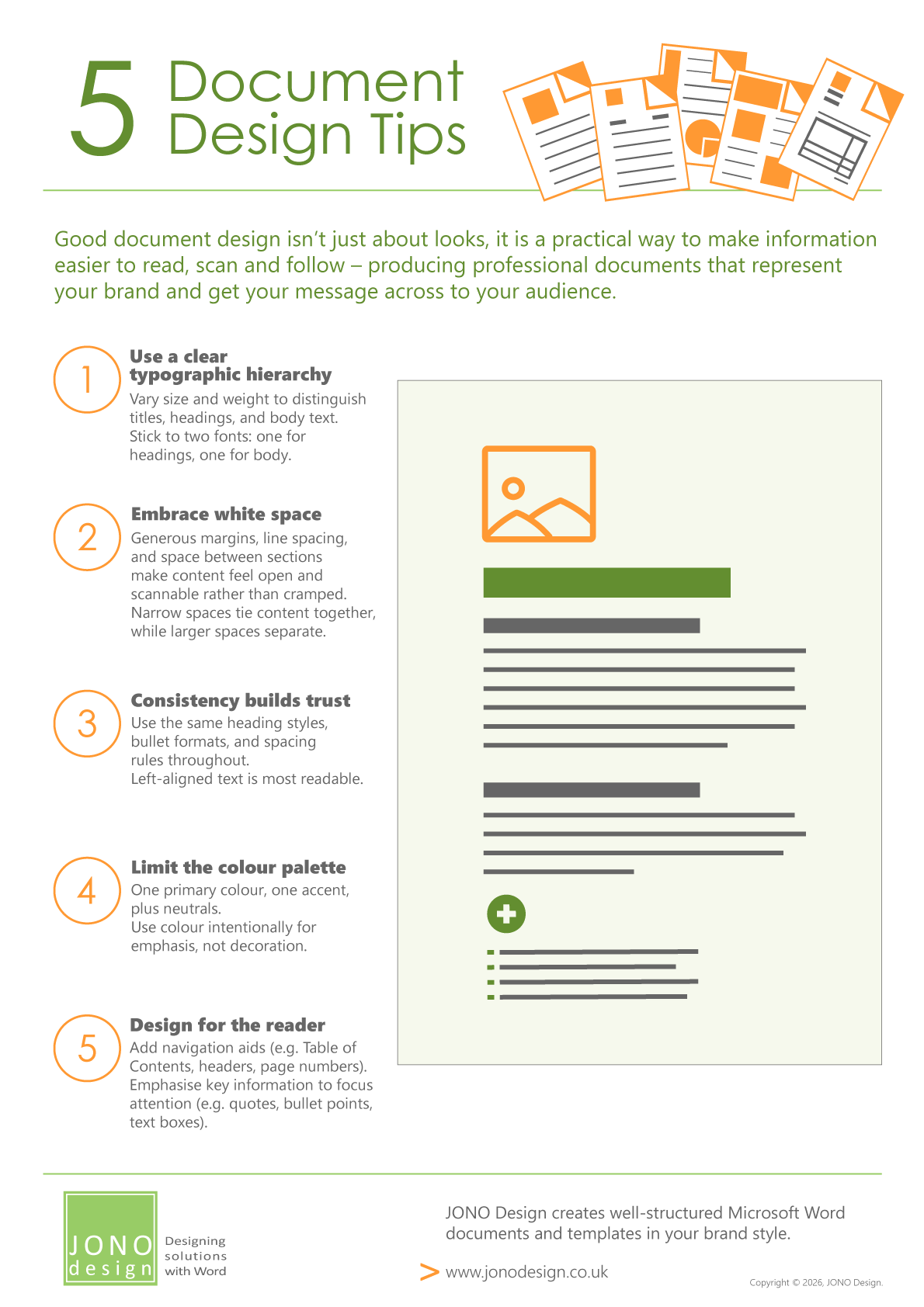
The Good document design is not just about looks, it is a practical way to make information easier to read, scan and follow – producing professional documents that represent your brand and get your message across to your audience.
Common mistakes to avoid in document design include unclear hierarchy, cramped layouts, inconsistent styling, and multiple formats. Ensuring a clear order of information, using adequate spacing, and maintaining consistent fonts, colours and formatting can significantly enhance readability and understanding. Be careful not to overdo it – too many variations can be confusing and cancel each other out. The use of well-structured, bespoke templates that are designed to easily produce documents in your brand style can make all this easier.
Here are five tips for better document design.
1. Use a clear typographic hierarchy
Use font size, weight (e.g. bold, regular, light), and colour to guide the reader's eye from the most important elements down to the details. Headings create the main skeleton for navigating a document, so it makes sense to make them stand out from the body text. This can be done by using one font for headings and another one for body text. The size, weight and colour of the font can be decreased to indicate a hierarchy of section and sub-section headings.
2. Embrace white space
White space (or negative space) is not wasted space – it is an important element in design, forming a frame for the content of a document. Generous margins, spacing between paragraphs, and breathing room around headings make content more scannable and less overwhelming. Aim for a consistent rhythm: spacing between sections, paragraphs and lines can be used to keep content together or to visually create breaks. Cramped documents suggest that they need to be ‘skimmed’, while well-spaced ones invite careful reading.
3. Consistency builds trust
Use the same text styling, colours, spacing and alignment throughout the document – a consistent, logical structure throughout will be easier for the reader to follow. Keep to one or two fonts throughout the document. In particular, headings and body text should be easily distinguishable yet harmonious. Unjustified, left-aligned text (like this paragraph) is the most readable. Unjustified formatting means the spacing between words is more consistent and the ragged right edge of a paragraph is easier for the eye to naturally distinguish between lines of text.
4. Limit the colour palette
Two to three colours is usually plenty: one primary, one accent, and neutrals (black, grey, white) for text and backgrounds. Use colour purposefully – to highlight key data, differentiate sections, or reinforce brand identity. Multi-coloured documents can dilute emphasis and look amateurish. When in doubt, use colour sparingly, with a single accent colour for headings and text boxes.
5. Design for the reader
The top third of a page is the most eye-catching part of the page, so put the most important information here. For example, the main title, a ‘hero image’ (a prominent visual), or set of key messages. A Table of Contents (for longer documents), headings, bullet points and text boxes give emphasis and help readers find important information with minimal effort.
How templates can help
Good document design is about more than aesthetics. It is a practical way to improve communication, reduce errors, and support consistent branding.
Well-designed templates provide a strong starting point, reducing the need to build each document from scratch. Instead of reformatting or recreating layouts for every new report or proposal, the focus can be put on creating engaging content. Using customised templates reduces manual errors, and maintains a professional standard across all documents.
This infographic appeared in JONO Design e-news. The e-news is published once every couple of months and each issue contains a specially designed infographic.
Click on the orange button to sign up for JONO Design e-news.

Get in touch to discuss your design requirements
or to request a quote.

enquiries@jonodesign.co.uk

Copyright © 2015-2026 JONO Design.
Designing solutions with Word