
Brand Identity
Brand identity is the way a brand is visually communicated - the way a logo, fonts, colours and graphic elements are used.
Brand guidelines bring all the design elements together and set out how they should be applied.
JONO Design can create logos, colour palettes, graphics and templates, as well as a style guide.
Examples of brand design projects
Click on the pictures below for a larger image. Links will open in a new tab.
To design a logo and visual identity for the Moorland Management Best Practice partnership project.
The design of the logo references the landscape and colours of moorland and includes a St. Andrews saltire motif to identify the project with Scotland.
A Style Guide defines the colour palette, font, text formatting, and image style for the project, as well as setting out how to use the logo. The layout of the Style Guide acts as a template for the project's best practice guidance notes.
The package delivered includes:
- a project logo
- a Style Guide
- a guidance note template.

To redesign the Scottish Outdoor Access Code education resource pack. The redesign created a Microsoft Sway in the new brand style as a gateway for accessing a variety of online teaching and learning resources.
A Microsoft Word template was created in the brand style, and this was used to create 19 documents that provide the information for each of the activities in the pack.
Graphics were designed for the Sway and for game cards. Photo cards were created, with guidance notes on the reverse, as one of the resources.
The package delivered includes:
- an MS Sway incorporating text, graphics, posters, story cards, photo cards, Word documents, and links to other resources
- graphics for 7 header banners, 1 for each section of the Sway
- an MS Word document for each of the 19 activities in the resource pack
- graphics for 20 game cards
- 18 photo cards.


To design a number of items that apply the client's new logo and brand style.
The designs incorporate the new logo, font, colours and gradient effects that form the core of the new branding.
Templates for an emergency travel card and marketing event calendar were designed using MS Word. The templates enable local offices to create and update them as needed.
The designs for pull-up banners use images, colour gradients and the logo to deliver key messages in a clear way. The simple design of the lanyard creates a professional look and ensures easy recognition.
The package delivered includes:
- MS Word emergency travel card template
- MS Word A4 marketing event calendar template
- Print ready PDFs for 3 pull-up banners
- Print ready PDF for a lanyard.


To design a logo, brand style and templates for a new project - the Scottish Marine Environmental Enhancement Fund.
The wave design and colouring of the logo represents the sea and the sand dunes of the coast. Colour, black and white versions of the logo were created.
The Style Guide: provides advice on using the logo; defines the colour palette; and sets the font for headings and body text.
The MS Word brochure template and PowerPoint slide deck take shapes from the logo to frame text and images. Together, the curves, colour scheme and fonts create a sophisticated design. The Word template uses image and text placeholders to structure the content.
The package delivered includes:
- Logo image files for online and print
- Style Guide
- MS Word A4 brochure template
- MS PowerPoint slide deck.


To create a new branding scheme for a church to provide fresh and recognisable graphics; and design of new stationery templates and promotional materials.
The new logo is a silhouette of the church roofline, a distinctive feature in the town. The logo is printer friendly for internally produced materials and can be used with colour blocks to produce promotional materials.
Word templates were designed for a letterhead, order of service, newsletter, compliments slip and notices. Large square posters were designed for the church noticeboard.


To develop an online document that can be navigated like a website that can also be edited; and design of supporting materials to promote the resource.
The document was designed and laid out in MS Word so that the client could edit it and keep it up-to-date in the future. The Word document contains clickable internal links and hyperlinks to online resources so that, when published online as a PDF, it will function like a website.
Circles, icons and colours help the user to navigate the pages of the resource and to provide an identity across the range of project outputs.
The package delivered includes:
- MS Word master version
- PDF version for publication online
- 2m x 1m roll-up banner
- A5 flyer
- four MS Word forms.


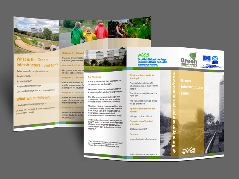
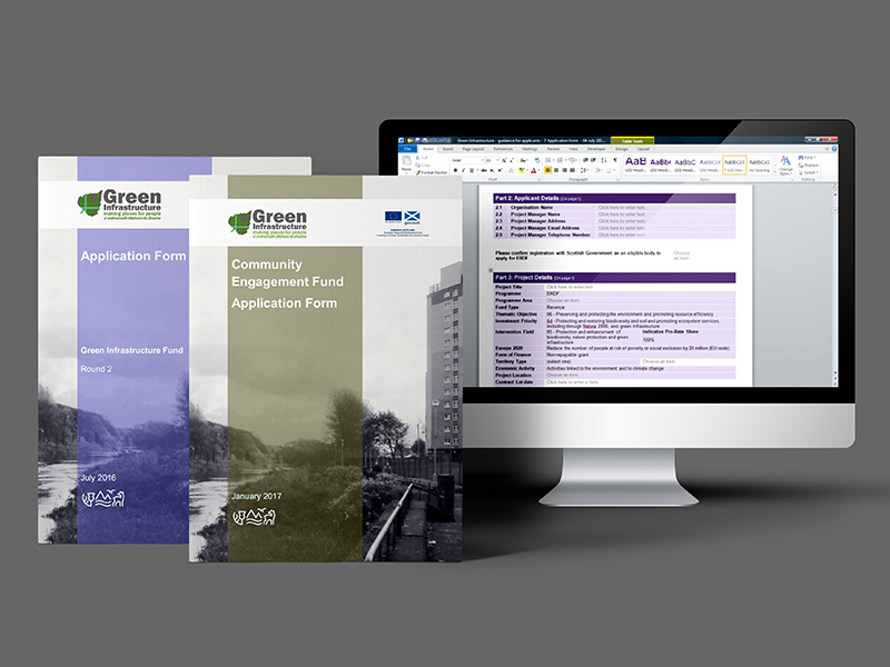
To develop a simple brand for a European Union funded programme to create green infrastructure in urban Scotland.
The design uses a tartan swatch to identify the programme with Scotland. The tartan pattern illustrates the aim of creating an integrated green infrastructure throughout the urban area, incorporating green and blue spaces and connections.
A logo, colour bar, colour palette and cover layout, together form the key elements of the brand design. In addition, leaflets and application forms were designed that applied the brand guidelines.
The MS forms contain content control fields, such as drop down lists and text boxes, that control what can be entered and edited. The forms allow applicants to enter information only in certain fields, and provide the completed file in an electronic format.
The branding package delivered includes:
- a logo and other graphic elements
- guidelines on applying the brand
- website design concept and graphics
- templates for a suite of MS Word documents and a letterhead
- an MS PowerPoint template
- A4 tri-fold and A5 leaflets and leaflet templates
- application forms in MS Word with editable fields.


Get in touch to discuss your design requirements
or to request a quote.
enquiries@jonodesign.co.uk
Copyright © 2015-2024 JONO Design.
Designing solutions with Word